

The site/stakeholder: The Australian Federal Government's Department of Education, Skills and Employment (DESE). The federal department responsible for the federations Education, Skills and Employment policy framework and implementation.
The task: To Redesign a government websites Information Architecture and Navigation system while applying heuristic evaluations and improvements, as well as a User Interface improvements and the application of a new style guide. The site also had to be responsive, and there was a focus on the mobile site redesign in particular.
*This was an unsolicited project as part of course work. The DESE was not involved in any part of this project.
5 Weeks - 2021
This was an individual project, however the research was conducted in teams by groups of 2-3. The User Research and early phases of research were conducted with Sarah Ronald and Vinita Prabhu.
As a team we conducted initial heuristic evaluations of the current site, followed by an analysis of the information architecture and the formation of a Proto-persona. We formulated a hypothesis upon our initiual research, around which we wrote up our first round of User Testing questions and tasks.
Our Hypothesis: The DESE site in its current state is text heavy, content heavy and has very little imagery. There was very little interactivity and some pages which seemed to have interactive elements were actually static. We hypothesised that this made it difficult for visitors to engage with the site on a meaningful level, and makes it difficult for the average user to navigate and find what they are looking for quickly and easily.
“It's just very black and white text. Because of my dyslexia, I really don't like to be reading through a lot of texts. I like to have clear indications of where you know where I need to go more like a memory map...It's just very very Boring, academic confusing.”
User subject: Ailish
“OK, ah, I'm looking for stem which I can't find, but it would be definitely a higher education stream, right?...I was looking for a sub, subtitle somewhere. It said research wasn't there so that's why I went up top.”
User subject: Doug
The findings from the user testing basically ratified what we had initially noted through our heuristic evaluations of the site. That the site was very text heavy and that this was a put off for many of the users. The site lacked imagery and that this would be good to incorporate into the site to aid in user interaction and investment.
Some of the key insights from below:
KEY PAIN POINTS:
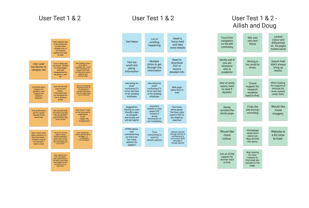
Affinity map | Testing results from first round of user tests. 6 people tested in total.
We found that most users (of DESE site) always went to the top navigation bar and found it convenient, though some found the groupings of information confusing and quite wordy. While the primary categories seemed to be organised on the department name, testing found that some categories weren’t in the places that most of our users thought they would be.
Testing also found that Users felt there was too much text, some of the labelling and headers were not distinct enough and that there was a doubling up of navigation which also confused and overwhelmed some of our users.
As such we felt there could be a number of improvements made on the labelling and ordering of categories as well as simplifying some of the navigational structure and organizing it towards the users needs.
The conceptualisation faze began with some card sorting, a redevelopment of the sites Information Architecture, and the development of a new desktop navigation system and layout.
The ideation phase really developed over the next 4 weeks, as each week of our project deliverables focused on different outcomes.
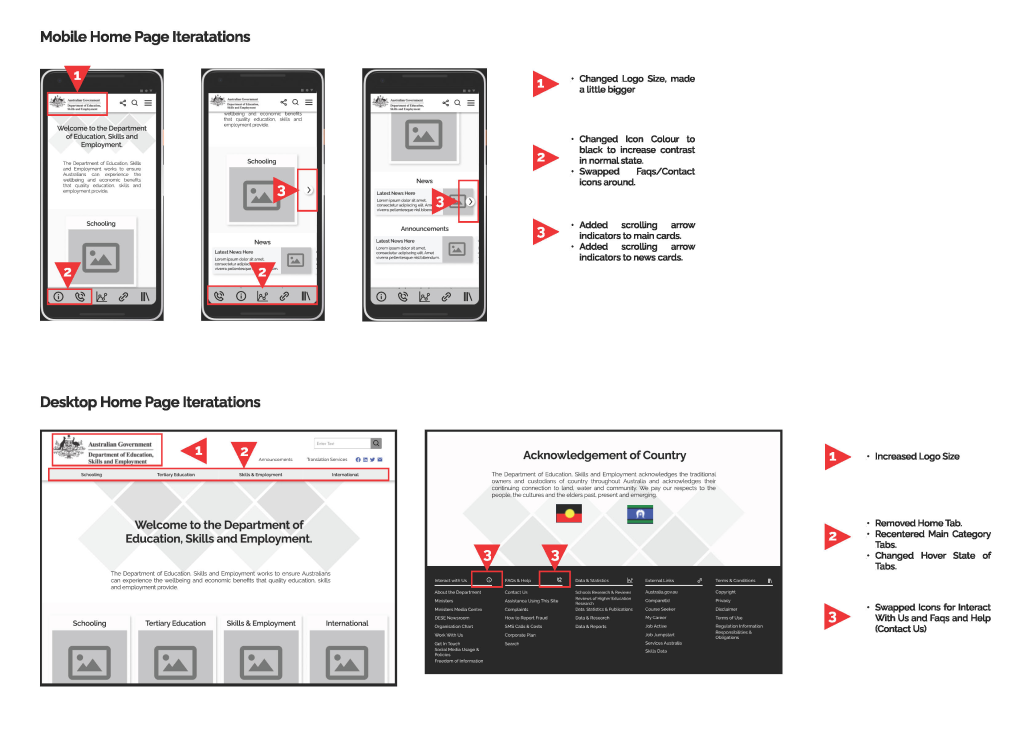
After redesigning, relabelling, and resorting the sites navigational architecture for desktop format, the focus then shifted to responsive redevelopment for mobile view. This focused primarily on the navigational system, as well as the general User Interface design of the site. The nav systems were developed over a number of weeks from low fidelity prototypes to high fidelity prototypes. Each iteration being bookended with user testing.
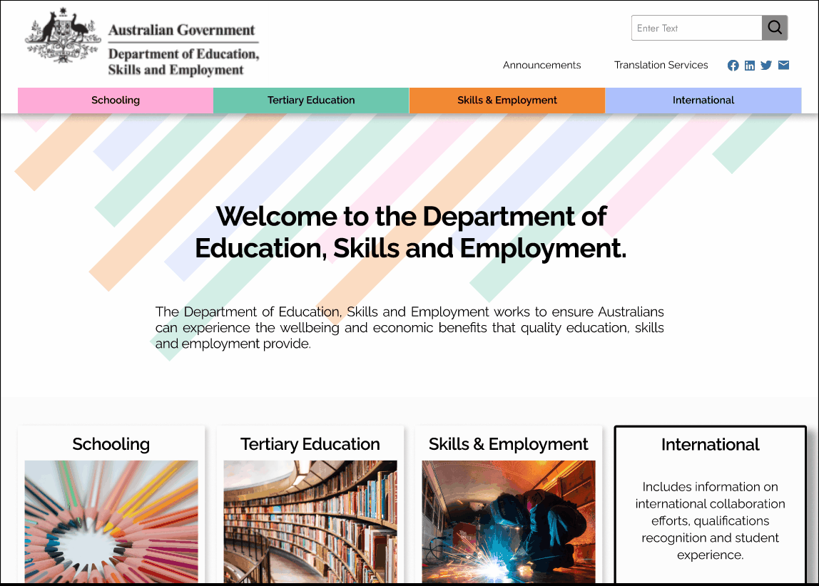
Desktop Navigation System | The redesign of the site map and architecture.Some quick example text to build on the card title and make up the bulk of the card's content.
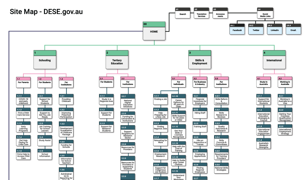
Site Map | The redesign of the site map and architecture.
For mobile I looked to create a more concise and direct dropdown menu system which provided clear breadcrumbs and reference points for the user. A simplification of the labelling and recategorization of the sub menu/catergories also occured
It was through this period that a style guide was also developed.


Over the course of the project there was a number of rounds of formal and informal user testing. Our initial round of user testing was on the current site and set the bar for the direction for the project. Each phase of prototyping was followed with user testing both on the navigation systems and the UI of the site.
Types of testing used at various stages:
5 Second Testing | Version 1 5 second testing on desktop and mobile navigation.
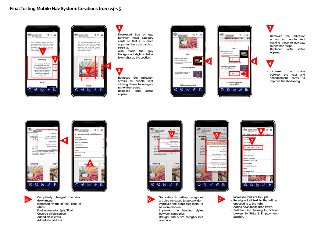
Final Testing Mobile | Version 4-5 user testing of navigation system.


Having a good balance of interactive elements, imagery and text can go a long way to improving a sites interactivity and inclusiveness. Government sites provide lots of information, however they can forget that many of their visitors want to find the information as fast as they can, and a site with too much text can be overwhelming (not to mention exclusive to those who have trouble with text. Including more imagery and iconography can go a long way to alleviate these problems.
How well a site manages to streamline their Information Architecture and make it clear, has a major bearing on the success of that site. It is important to take the position of the user when building these sites and consider making them more interactive. Just because it is a government site doesn’t mean it doesn’t have to be fun and engaging.
Key Learnings:
When working with such a large, content rich site, improvements to the navigation are continual, and strong consideration needs to be given to labeling and titling.
Opportunities going forward: