
To choose a NFP (Not for Profit) website with heuristic and user issues and improve upon them, while adding/improving features that adds to the user experience for the chosen charity. (This was a group project as part of a UX/UI Bootcamp and was unsolicited by the charity).
Timeframe: 2.5 weeks

Andre White
UX/UI Design
Melissa Naval
UX/UI Design
Nicholas Love
UX/UI Design
We choose an organization called Backpacks 4 VIC Kids, a Not for Profit organization in Melbourne, Australia, which provides children who are in refuge, foster care or other with a bag of basic essentials to help them cope with traumatic transitions in their lives. The charity relies on the donations of individuals and businesses as well as the aid of volunteers in delivering their services.
We discovered some core issues in B4VK's website design and information architecture which we felt could be improved upon to improve user experience and connectivity. With the aim to connect more people quickly and effectively to the organization with positive outcomes and increased awareness.
We initially conducted a number of heuristic evaluations which highlighted some key issues and design/usability problems.
Very text heavy. Could decrease copy to create stronger text.
Labelling and Information Architecture needs to be improved.
Inconsistent icons and design elements.
Very text heavy. Could decrease copy to create stronger text.
Labelling and Information Architecture needs to be improved.
Inconsistent icons and design elements.
After our initial evaluation, we devised our interview plan based around peoples volunteering and donating habits. We conducted 5 user interviews about charity work/volunteering, as well as conducting a stakeholder interview with the creator of the NFP.
We completed this phase with some competitor analysis of 3 different charitities and one direct competitor.
“[On volunteering] I think like demographically being a time poor and money poor Uni student is kind of making it difficult.”
- Erin.
“[I mainly hear of organisations through] word of mouth. Somebody else I know that becomes very involved and tells me about it.”
- Susan.
“Even if worst comes to worst I have to be in another state, if I can still help online, I would still help with them. I know what the cause is. I'm friends with the people themselves. I'm ok doing volunteer work with them.”
- Ethan.
Much of these results from our interviews were ratified by our Google survey as well as our Stakeholder interview.
.png)
.png)
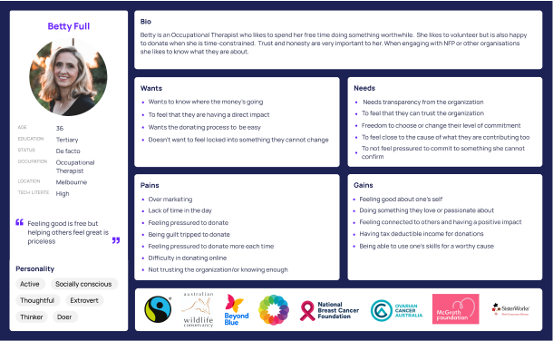
From here we developed our User Empathy Maps and User Persona.
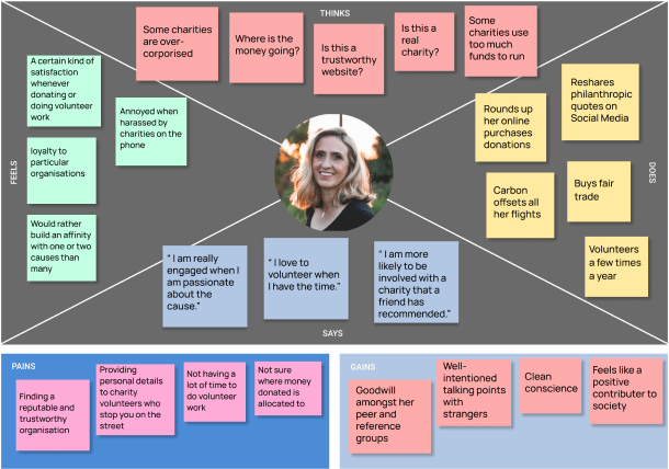
Does'nt want to be pressured into donating
Lacks time to research a charity properly
Being harrassed to constantly donate more
Does'nt like over marketing
Wants to feel good about themselves
Wants to be able to volunteer on their terms
Wants Good Transparency
Needs it to be easy to Donate or Volunteer
Based upon our user research, affinity diagrams, empathy mapping and user persona we came up with the following Problem Statement:
“We have observed that our users prefer to support non-profit organisations based on ‘word of mouth’ and recommendations of friends and only support organisations they view as reliable and trustworthy. They want the donation and volunteering process to be quick, seamless and trustworthy because they are often time poor or limited in their ability to donate or volunteer and don’t want to waste their time with dodgy charities.”
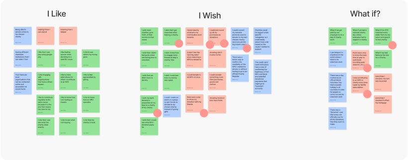
Keeping in mind the main pain points and wanst/wishes of our User Persona, we began ideating with the I Like, I Wish, What If method. After which we developed key features through feature prioritization matrix, which saught to address the key pain points and needs of the user.
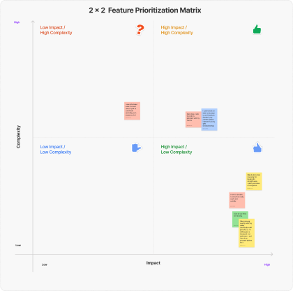
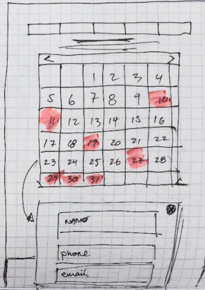
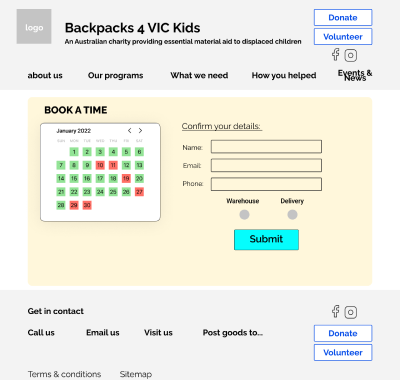
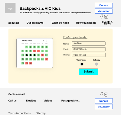
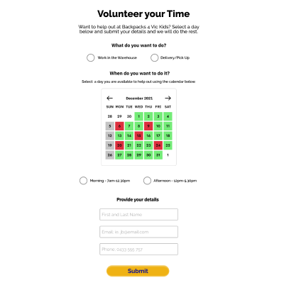
Interactive calendar for volunteers to sign up directly, and donate their skills.

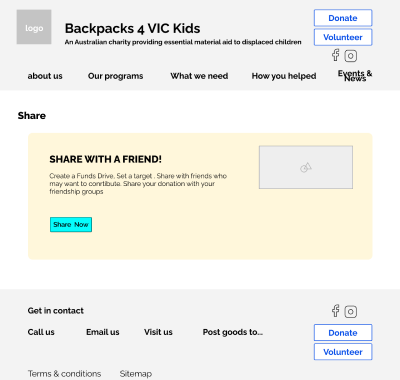
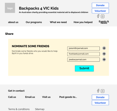
A share function to alert friends of donors that they have donated and inspire others to donate.
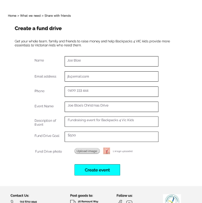
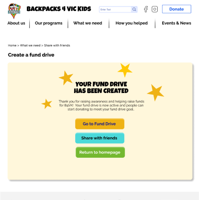
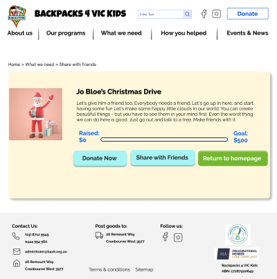
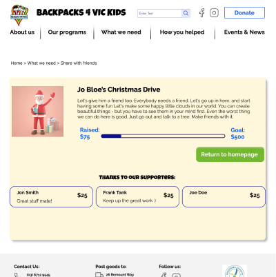
Create a fund drive through the site with realtime updates.
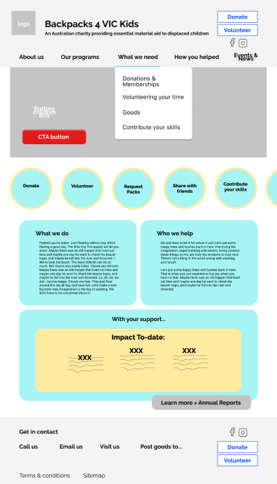
We also looked to improve the sites Information Architecture and styling to improve usability and also transparency.
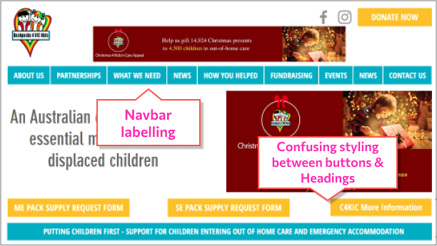
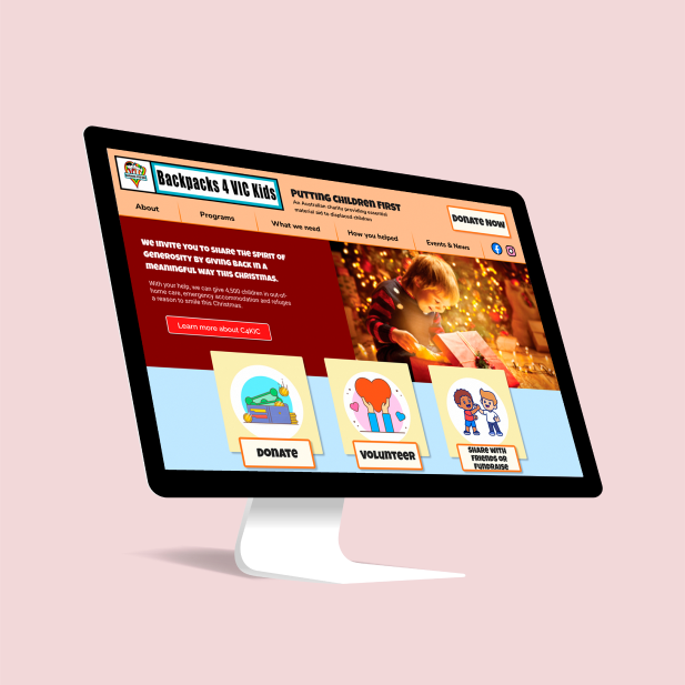
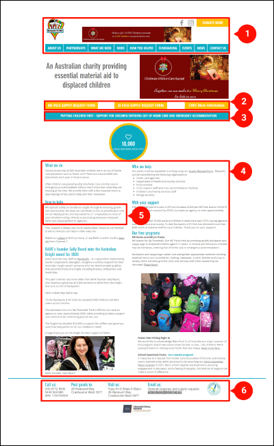
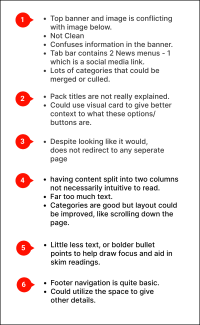
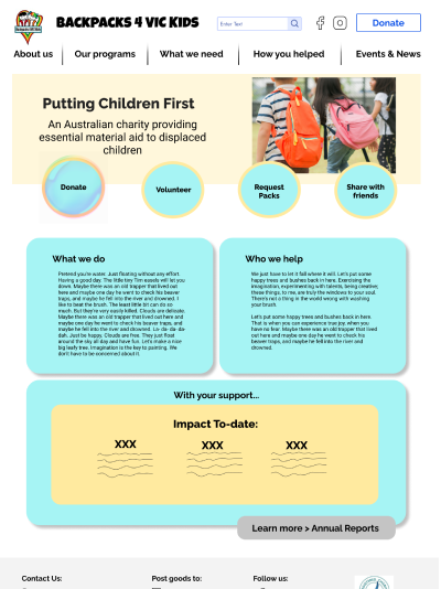
Current sites homepage navigation.
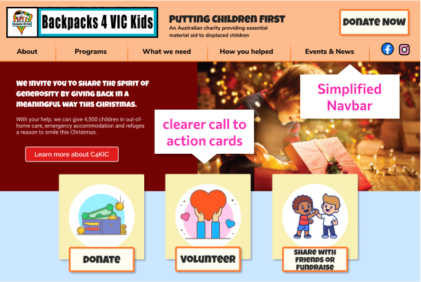
Our redesign of the navigation and homepage.
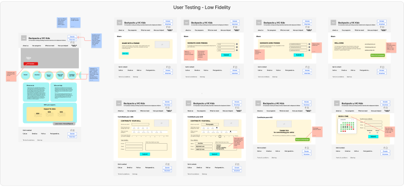
Focusing on our three main features, as well as the aim to improve the overall UI and heuristics of the site, we set out with three stages of prototyping and two rounds of user testing as well as some A-B testing.
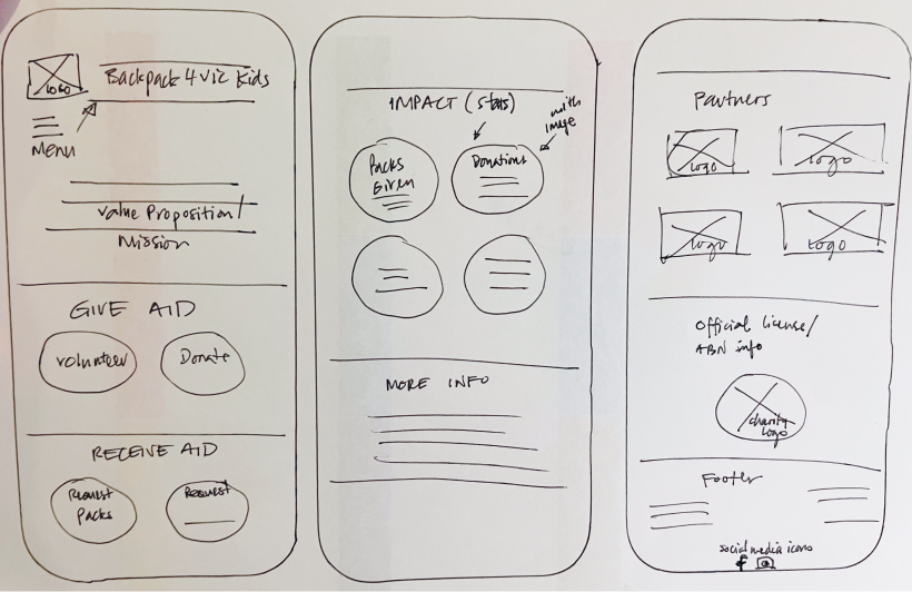
Here we have ideas for page layouts and call to action icons. This is in mobile app format.
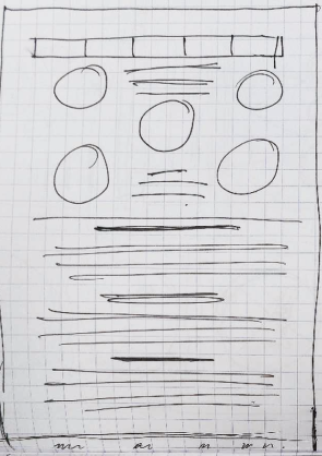
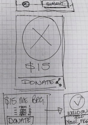
Paper wireframes of the home page, volunteering calendar and donation icons and modules.
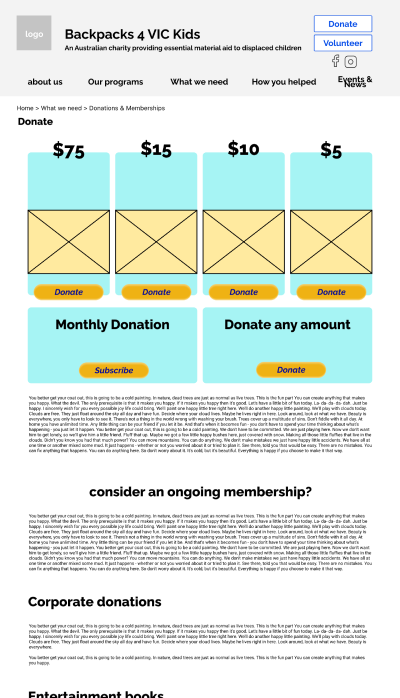
Home page and donation pages.
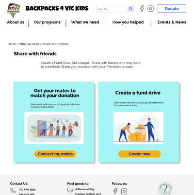
Share with a friend pages.
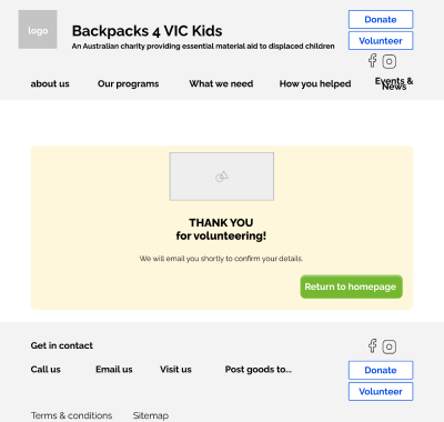
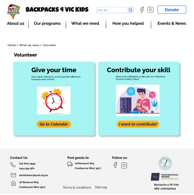
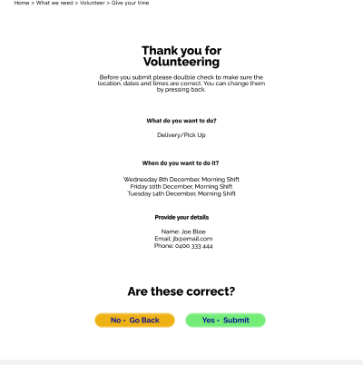
Volunteer flow.
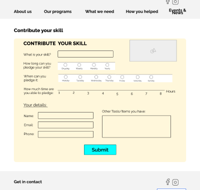
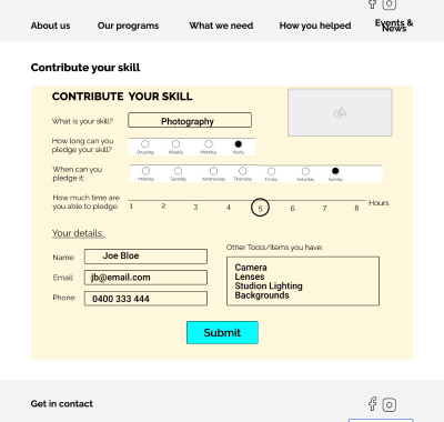
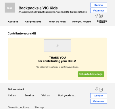
Contribute a Skill flow.
Felt the Contribute Your Skills button and Volunteer button on home page could be merged.
Wanted the task radials (warehouse/delivery) on the voluteer form should be moved to top.
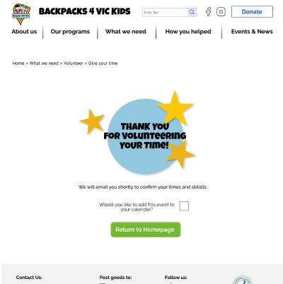
Wanted the Return to Homepage button more central on the Thank You Pages.
Found the Call to action button on home page confusing. What was it for.
Wanted an easy donation amount to pick.
Voluteer Flow.
Create a Fund Drive.
Problem: Finding the Share with Friends button on home page was a little confusing as they would see Request a Pack first.
Solution: Seperate the Request a Pack link from the other call to action buttons.
Problem: Wanted to be able to Share with Friends that they had volunteered to encourage them to voluteer.
Solution: Add Share with Friends button to Voluteer confirmation page.
Problem: Users had issues understanding what the colours meant in the volunteering calendar.
Solution: Add a colour key to the calendar.
Upon collating our testing results and conducting some A-B Testing we applied our style guide to the prototype.
When conducting our research, we discerned that most people who donate or volunteer, do so predominantly on word of mouth. They want to see transparency of where their money/time goes, and they are generally constrained by time and availability. They also donate or volunteer as it makes them feel good about themselves and has a positive social outcome.
Designing sites for NFPs therefore requires a UI and functionality that:
For our project improving the functionality of the site worked best. Were we to continue on the project, we would have looked to continue to improve the UI of the site as well as its styling. Reducing copy and improving the overall architecture.